A restaurant Brand Kit is a practical system for colours, type, image direction, caption voice, campaign graphics and simple usage rules. It is not necessarily a rebrand. It makes every post, ad, email and page feel like the same venue.
One caption sounds like fine dining. The next sounds like a nightclub. The graphic uses a new font because someone found it in Canva. The email looks unrelated to the ad that sent people there.
The problem is not effort.
The problem is that nobody wrote the rules down.
HospoPro builds the Brand Kit first, then uses it across the rest of the marketing engine.
A Brand Kit is not a 90-page brand book
Most venues do not need a document nobody opens.
They need a short operating system.
A useful restaurant Brand Kit should answer:
- Which colours do we use?
- Which typefaces do we use?
- What does a promotion graphic look like?
- How do captions sound?
- Which words do we avoid?
- How much text belongs on an image?
- What should food photography feel like?
- How do ads, emails and landing pages stay connected?
If a new designer or account manager can use the kit within one day, it is doing its job.
The six parts that matter most
1. Colour
Choose a small working palette.
A practical set may include:
- One main dark colour
- One light background
- One accent
- One secondary tone
- One utility colour for warnings or prices
The aim is not to use every colour in every post.
It is to stop each campaign from starting again.
2. Typography
Define:
- Headline type
- Body type
- Detail or label type
- Capitalisation rules
- Number and price styling
Restaurant graphics often fail because every line fights for attention.
The kit should show a clear hierarchy:
- The reason to care
- The useful detail
- The action
3. Caption voice
“Friendly” is not enough.
Write the voice as observable rules.
For example:
- Warm, short, no fluff
- Lead with the dish or occasion
- Use plain English
- Avoid corporate phrases
- Do not call everything “mouth-watering”
- Use one call to action
- Keep urgency truthful
Then show examples.
Too generic:
Join us for an unforgettable culinary journey featuring delicious flavours and exceptional service.
Closer to the venue:
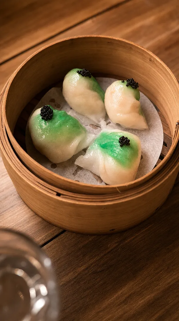
Wontons at five. The good table is yours.
The second line has a point of view.
4. Image direction
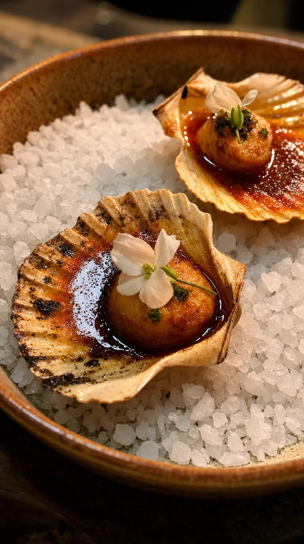
Define what the venue should look like.
Questions include:
- Warm or bright?
- Busy or minimal?
- Tight food details or wider table scenes?
- People visible or food-led?
- Polished editorial images, fast phone moments, or both?
- Which surfaces, props and backgrounds feel true to the room?
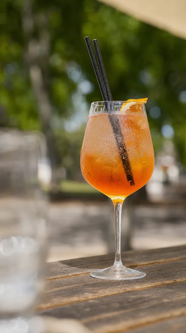
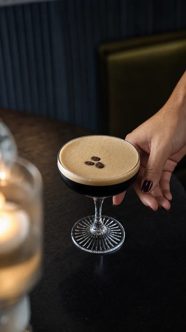
A consistent image world matters as much as a logo.
5. Graphic templates
Build a small set for the repeatable commercial moments:
- Weekly special
- Event
- New menu
- Booking reminder
- Sold out
- Review
- Gift card
- Private dining
A template should speed up work without making every post identical.
6. Usage rules
Write down simple decisions:
- Maximum words on an image
- Where the logo sits
- Whether prices include dollar signs
- How dates are formatted
- Whether emojis are used
- Which offers need terms
- How much notice an event receives
- Which approval is required before publishing
Small rules prevent large inconsistency.
Build the kit from the venue that already exists
A Brand Kit should not invent a personality the team cannot deliver.
Start with:
- The menu
- The room
- The service style
- Existing reviews
- The founder or chef’s natural language
- The guests who already return
- The best existing content
If the room is warm, informal and loud, the copy should not sound like a luxury hotel brochure.
If the venue is precise and quiet, forced slang will feel equally wrong.
The 60-minute Brand Kit workshop
Use this structure.
Minutes 1 to 10: the venue in three words
Pick three words that describe the actual experience.
Then choose three words the venue is not.
Example:
We are: generous, sharp, relaxed
We are not: formal, loud, gimmicky
The negative list is often more useful.
Minutes 11 to 20: the guest
Write down:
- Who comes now
- Who you want more of
- What occasion brings them
- What they value
- What makes them hesitate
Minutes 21 to 30: the voice
Collect:
- Five captions that feel right
- Five phrases the team actually says
- Five banned clichés
- One sample promotion
- One sample reply to a guest
Minutes 31 to 45: the visual system
Choose:
- Core palette
- Type hierarchy
- Photo mood
- Graphic examples
- Logo spacing
Minutes 46 to 60: the rules
Define:
- Approval process
- Offer formatting
- Date and price rules
- Channel differences
- What never goes live
You now have something usable.
The Brand Kit should show up everywhere
A strong kit connects:
- Feed posts
- Stories
- Meta ads
- Google creative
- Landing pages
- Menus
- Outdoor screens
- Partnership material
The customer may see the venue in several places before booking.
Each interaction should feel familiar.
When the kit needs an update
Review it when:
- The venue changes concept
- A major menu direction changes
- The room is renovated
- A second location opens
- The current voice no longer matches the guest
- Templates have become repetitive
- The team keeps breaking the same rule
Do not redesign it because the marketing team is bored.
Consistency is meant to feel familiar to the customer before it feels repetitive to the people making it.
The final test
Place one post, one ad, one email and one landing page side by side.
Remove the logos.
Do they still look and sound like the same venue?
When the answer is yes, the Brand Kit is working.
Build the system before the next campaign
Every HospoPro plan begins with a custom Brand Kit that defines the venue’s colours, type, caption voice, graphic direction and simple usage rules.
FAQ
Do I need a full rebrand to fix my restaurant’s inconsistent look online?
Not always. The usual problem is that nobody wrote the rules down. A Brand Kit fixes that by setting your colours, fonts, photo style, caption voice and templates. Build it from the venue you already have, not a new personality.
What should a restaurant brand kit include?
Six parts matter most: colour, fonts, caption voice, photo style, graphic templates and usage rules. Keep it short, not a 90-page brand book. If a new designer can use it within one day, it is doing its job.
How long does it take to make a restaurant brand kit?
You can make a usable kit in a 60-minute workshop. Cover the venue in three words, the guest, the voice, the look and the rules. Also pick three words the venue is not, because that list is often more useful.
How do I write captions in my restaurant’s brand voice?
Turn the voice into clear rules, because “friendly” is not enough. For example, keep it warm and short, lead with the dish or occasion, use plain English and stick to one call to action. Keep any urgency true. Then show real examples that sound like the venue.
How can I tell if my restaurant brand is consistent?
Put one post, one ad, one email and one landing page side by side. Cover up the logos. If they still look and sound like the same venue, your Brand Kit is working.

We run the photos, posts, ads, email and reporting for hospitality venues across South East Queensland. Everything in this guide comes from doing the work on live venues, not a textbook.